Well, it's probably more of an evolution - dropping some of the busy elements and tying in with the Chandler Motorsport brand by using the same font...
So here it is:
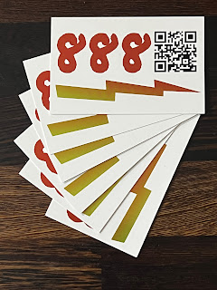
Even got some new "business cards":
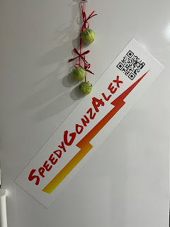
And of course magnetic signs for the cars (well here on our fridge)...
I hope you like the simplified approach.


Comments
Post a Comment